


The Best Macro Indicator
High-Yield Spreads as a Market Canary

Exciting news: QuantMage just got a powerful upgrade! Alongside stock prices and various index data, it now supports multiple macroeconomic time series from the Federal Reserve Economic Data (FRED). Today, I want to dive into one specific indicator that’s now available: the ICE BofA US High Yield Index Option-Adjusted Spread.
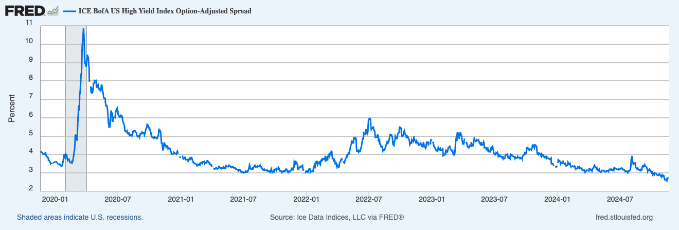
So, what’s the high-yield spread all about? Simply put, it measures the difference between the borrowing rates for below-investment-grade corporate bonds (usually issued by smaller, cyclical companies) and the corresponding US Treasury spot rate. An insightful article even dubs it the best macro indicator out there. Naturally, I was eager to explore its potential as a market canary now that it’s accessible in QuantMage.
📣 Quick disclaimer: This content is purely informational. It’s not investment advice or a recommendation to buy or sell any stocks. Always do your own research and consider consulting a financial professional before making any investment decisions.
Simple Checks
First off, I tried a straightforward approach: checking if the spread is below a certain value to signal a bullish stance.
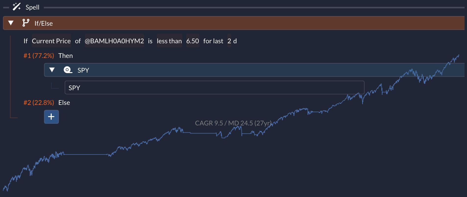
In this example, I used a threshold of 6.5 and checked it over two consecutive days to decide whether to enter SPY (the S&P 500 ETF). If not, it switches to cash. This simple rule already yields a respectable result: a 9.5% compound annual growth rate (CAGR) and a 24.5% max drawdown (MD) over a 27-year period. That’s a much better risk-adjusted return compared to a buy-and-hold strategy with SPY, as the annual return is similar but with significantly lower drawdown and volatility.
Next, I checked whether the spread is falling (bullish) or rising (bearish), which also produced decent outcomes:
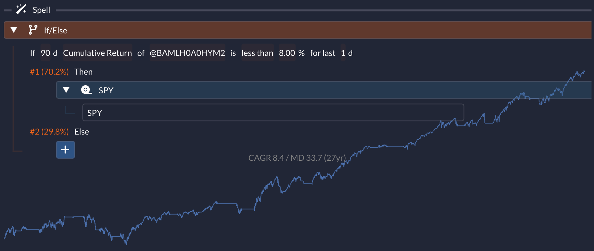
Here, it examines the 90-day (about 4.3 months) change in the time series and goes risk-on if the spread isn’t rising by 8% or more. The performance is slightly less impressive than the previous example, but it still easily beats the SPY buy-and-hold in terms of risk-adjusted returns.
Cycle-Driven Approach
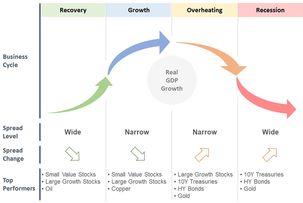
An article from Verdad I mentioned earlier outlines an interesting asset rotation strategy based on market cycles: Recovery, Growth, Overheating, and Recession. It suggests that these four cycles can be identified using the high-yield spread’s base level and its rate of change. Specifically, it compares the current value against its 10-year trailing median to determine the base level and uses its 3-month change for the rate of change:
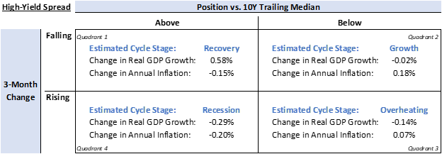
The article also points out which asset classes tend to perform better in each cycle:
I decided to emulate this strategy in QuantMage:
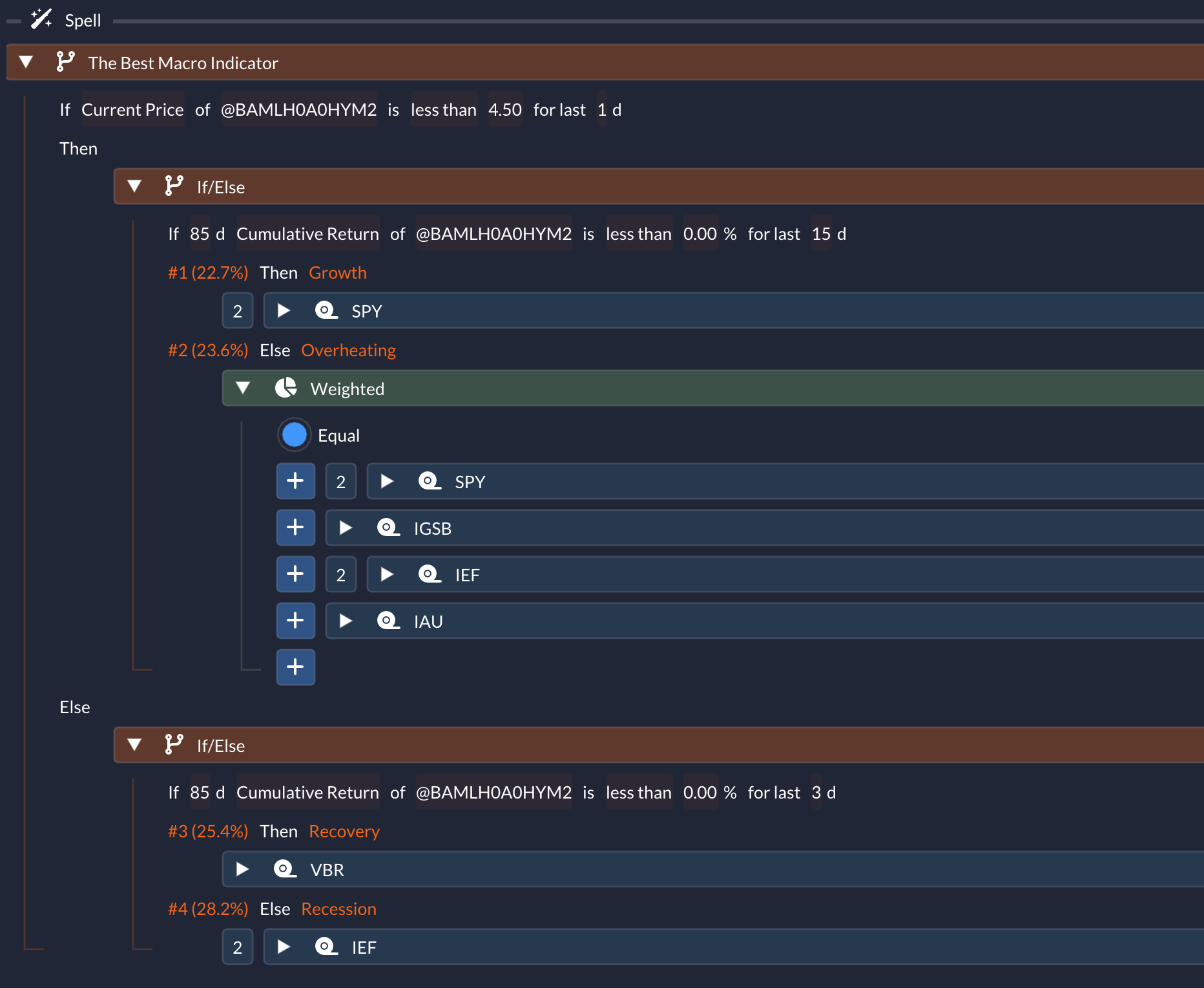
As you can see, I used an arbitrary threshold of 4.5 instead of the 10-year trailing median to assess the base level. I opted for an 85-day (roughly 4 months) cumulative return instead of the suggested 3-month change to measure the rate of change—it just produced better results in my experiments. I also made some adjustments in selecting the assets for each cycle. I used VBR to represent small-cap value stocks and IGSB for investment-grade corporate bonds. Instead of diversifying as suggested in the article, I chose to invest in the single best-performing asset for the Growth, Recovery, and Recession cycles. And check out the impressive performance it generates:
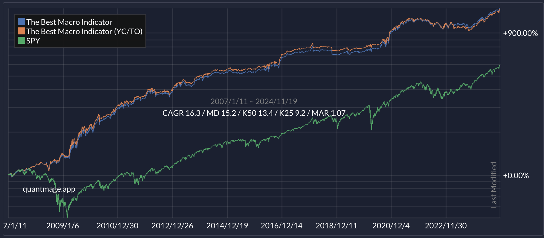
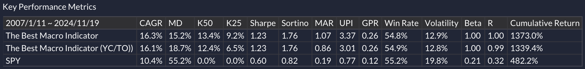
It achieves a 16.3% CAGR, a 15.2% max drawdown, and a Sharpe ratio of 1.23 over a 17-year period! I admit, I tweaked and tuned a few parameters to optimize the results, but at this point, it’s hard to deny that the high-yield spread is a potent market canary. Feel free to give it a try yourself here.
Bottom Line
My quick experiments, which took less than an hour, already show promising performance statistics. Further research—like combining this with other canary signals or exploring its potential as a momentum crash predictor (as highlighted in another Verdad article)—could be really fruitful.
What do you think? Do you have any strategy ideas involving high-yield spreads? Are there other macroeconomic time series you’d like to incorporate into your systematic strategies? Feel free to share your thoughts or experiences in the comments below! 💬👇
This is great, thank you!
I have been using the $$HYIOAS symbol on Stockcharts for quite some time, but in a more primitive way. I use its trend as a simple measure of risk; when its 50 dma is above its 200 dma, then beware. Worked well for instance in '21, '22 and '23, but was noisy in '19 and unproductive in '14 and '15. Your QuantMage algo looks very promising, in contrast, as goes beyond a simple risk-on risk-off switch. I need to look into it!
As to Verdad's asset-class cycle diagram: if it also has a 17-year lookback, that would explain why it does not include an inflationary recession. Or the aftermath of an all-asset bubble where nothing but cash works. Both of which we had in 2022... I personally had a lot of IEF in '22 that I wish I had discarded in time.
Not at all to denigrate this excellent indicator, but beware of investing in treasuries or in hi-yield bonds if we get an inflationary recession crash in 2026.